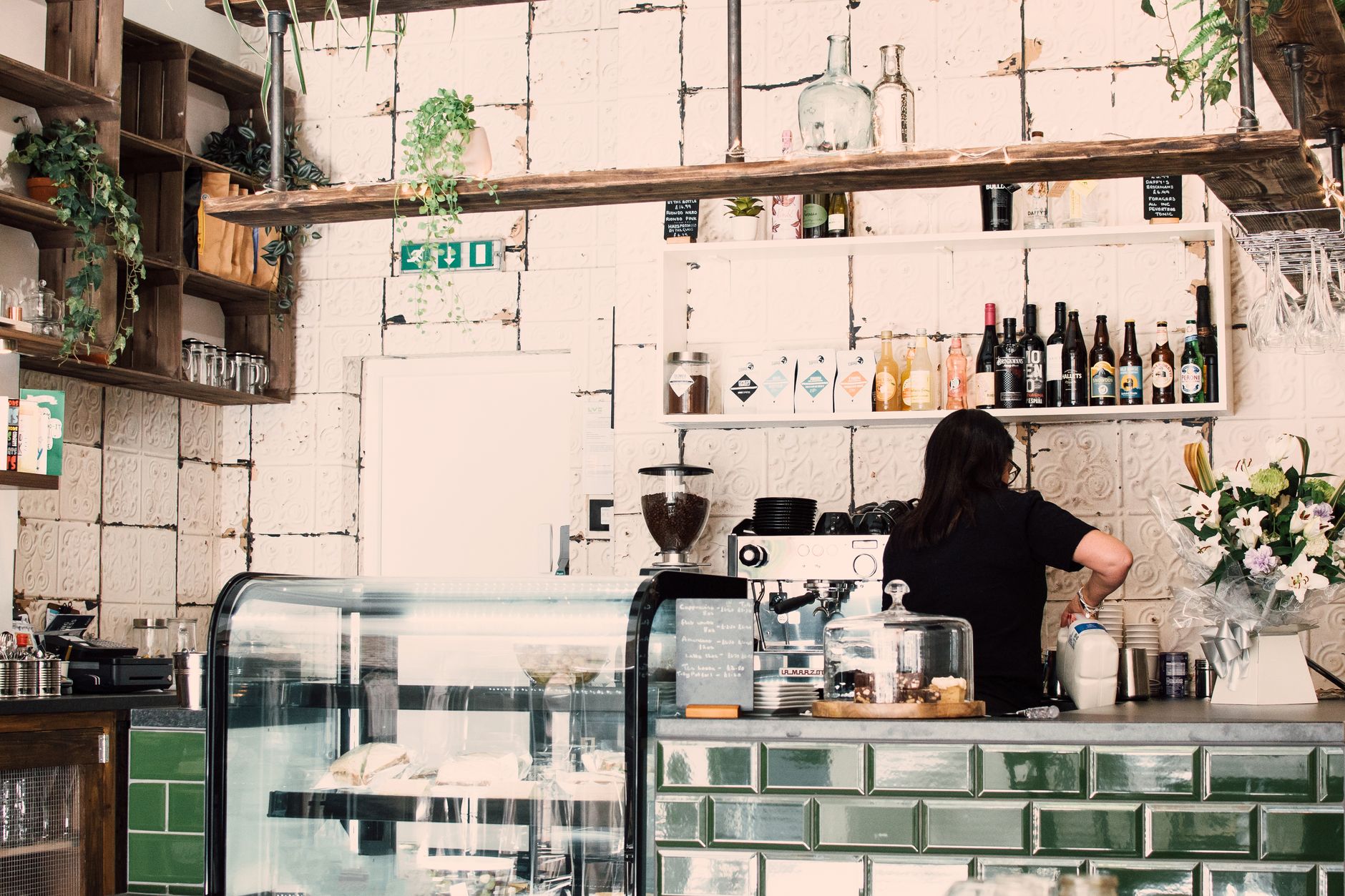
White subway tiles. Filament bulbs on black flex. A reclaimed wood counter. Exposed ductwork, a monstera in the corner, a sans-serif logo in lowercase, and a menu written in chalk that is not chalk.
This café exists in Seoul, Lisbon, Melbourne, Mexico City and probably within a mile of you. It is not a chain. The reason it looks identical is that photographs, rather than people, now do the travelling, and a room is increasingly designed for the photograph.
The look has a name
The writer Kyle Chayka called it AirSpace in 2016: the flattened, frictionless aesthetic that emerged as platforms for sharing rooms, rating places and posting pictures went global at the same time.
The components are consistent enough to list, and the consistency is the interesting part. Reclaimed wood. Edison bulbs. Subway tile. Mid-century chairs. Concrete or exposed brick. Abundant plants. Minimal signage in a geometric sans-serif. Natural light treated as the primary design material.
How image-first discovery taught the world one aesthetic
Before, a new café owner looked at cafés they had been to. Their reference set was local, so local styles persisted and diverged.
Now the reference set is a feed, and the feed is global and ranked. An owner in one city and an owner in another are looking at the same saved images, because the ranking system showed both of them the same top performers. The inputs converged, so the outputs did.
The ranking matters more than the browsing. What surfaces is what performed, and what performs is what photographs well: high contrast, natural light, uncluttered surfaces, a recognisable palette. That is an algorithm selecting for photogenic qualities, and interiors then get built to satisfy it. The room is not the product. The picture of the room is.
The café is not designed for the person sitting in it. It is designed for the photograph the person sitting in it will take.
What the look is signalling
It reads as a set of promises, and it is remarkably efficient at delivering them without a word.
The exposed materials say independent rather than corporate. The plants say considered. The minimal signage says confident. The tile says clean. Collectively they say: the coffee here is taken seriously, the wifi works, you may sit for an hour with a laptop, and you are among people like you.
That last part is the real function. It is a taste signal marking who a place is for, doing the same work in a room that IYKYK does in a caption: legible to the intended audience, quietly unwelcoming to everyone else. Its accompanying tip screen, and the awkwardness it produces, is the same story about who pays for service playing out on the counter.
The boring reasons, which matter more than the interesting ones
Convergent aesthetics get explained in cultural terms when a good part of it is procurement.
- The suppliers are the same. A handful of manufacturers make the espresso machines, the bulbs, the chairs. Global supply chains mean everyone furnishes from a similar catalogue.
- The look is cheap to build. Exposed brick and ductwork means not building walls and not boxing in pipes. Reclaimed wood is inexpensive. Industrial minimalism began as a way to open a room without much money, and became a style afterwards.
- It de-risks the loan. A first-time owner presenting a familiar concept is easier to finance than one presenting something nobody has seen work.
- It photographs in any light. A neutral palette and hard surfaces are forgiving to phone cameras in a way that patterned wallpaper and warm dim lighting are not.
Is it actually bad
Worth resisting the easy answer. The style is comfortable, functional, and it travels: a traveller can read a room in a second and know what it offers. Standardisation is why you can find decent coffee in an unfamiliar city without research, and that is a real gain.
What is lost is legibility of place. A room that could be in eighty countries tells you nothing about the one you are in, and the local styles it displaced were often specific to a climate, a material or a way of sitting that had a reason behind it.
The wider pattern
Cafés are the visible case, not the only one. Short-term rental flats have converged on the same handful of items. Product pages, app interfaces and startup logos have each narrowed towards a house style. Wherever discovery is mediated by a ranked feed, and the reference set becomes global, the same flattening follows.
It is a curiously modern kind of sameness: not imposed by a chain, but arrived at independently by thousands of people all looking at the same screen. The world is not converging on everything. Traffic still runs on different sides of the road for reasons no feed will fix.
The short answer
Every new coffee shop looks the same because their owners share a reference set, that reference set is ranked by what photographs well, and the materials that photograph well are also the cheapest way to open a room. Nobody decided. Everyone optimised for the same thing.